Meet Horizon UI · 5/16: The 3D Infrastructure Map
This is the fifth post in the Meet Horizon UI series. Part 3 drew the map between services and Part 4 drew it inside one service. This post zooms all the way out: a single WebGL view of your entire deployment at once — every SkyWalking layer’s services rendered as cubes, stacked in 3D, with live traffic, alarms, and the calls between them. It’s the “stand back and look at everything” companion to the per-layer dashboards.
It’s also genuinely interactive, so rather than describe it cold, here it is — the real map running on the demo’s sample data. Drag to rotate, scroll to zoom, click a cube:
One scene for the whole estate
The 3D map is a standalone, full-screen view at /3d/map, opened from the 3D Infra pill in the topbar. It deliberately drops the rest of the console — no sidebar, no topbar, no global time picker — so the scene gets the whole viewport. The SkyWalking mark sits bottom-left; the × top-right returns you to Horizon. Everything in it is read live from the same OAP the rest of Horizon talks to: the service roster, each layer’s topology, the per-service traffic, and the active alarms.
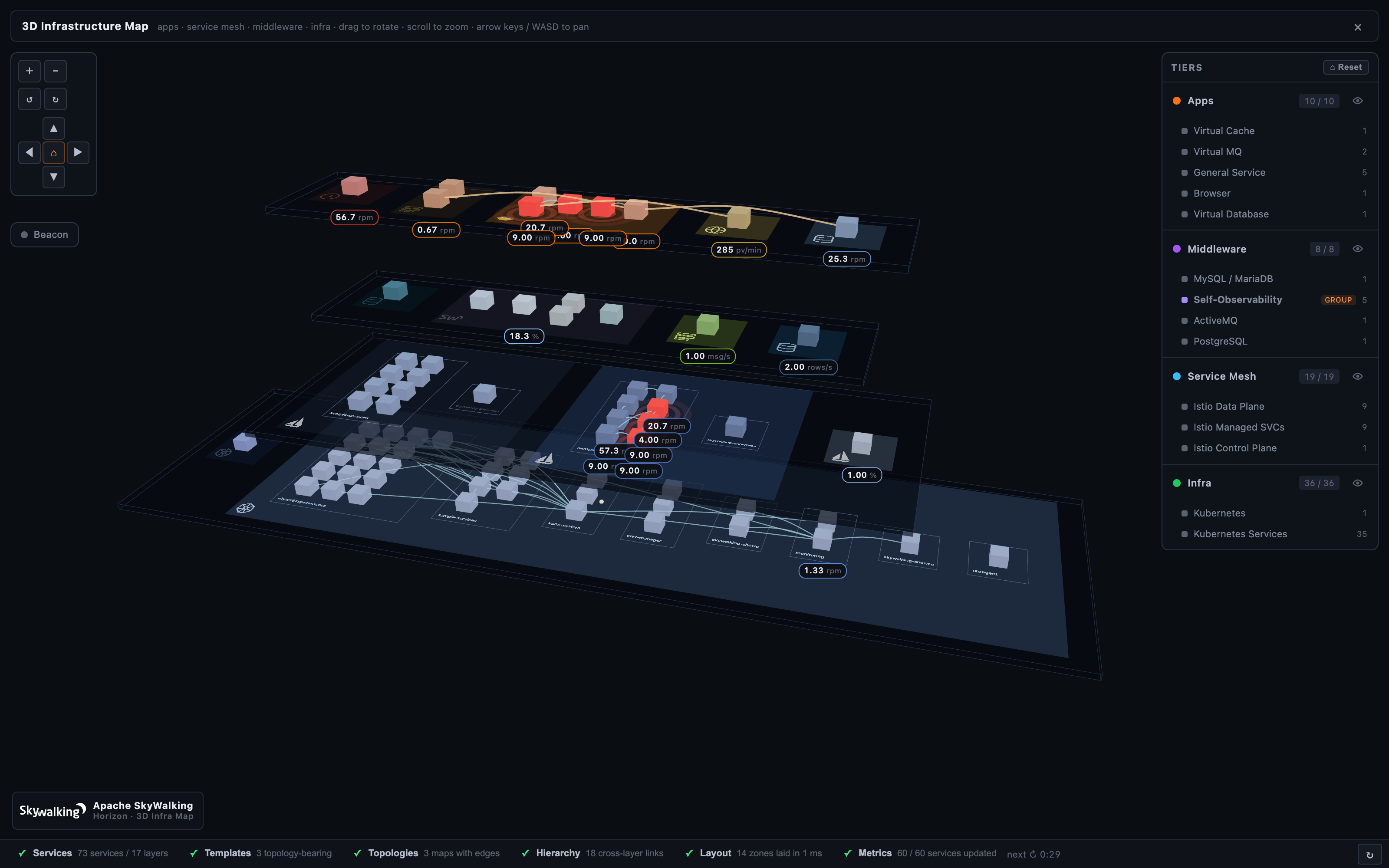
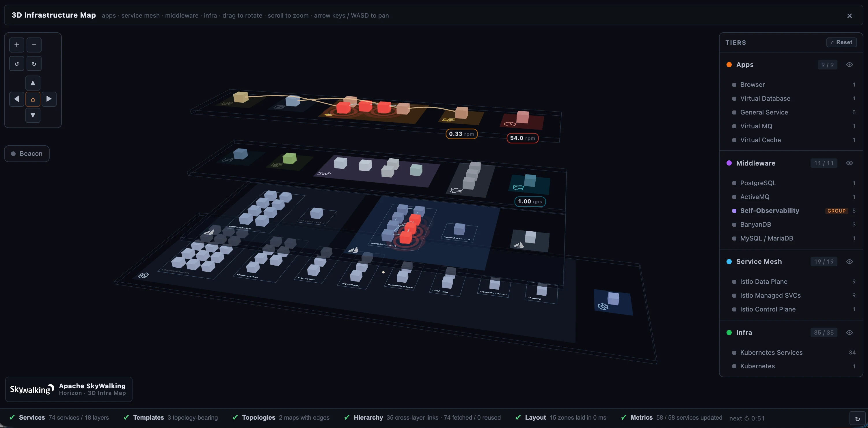 Figure 1: The whole deployment in one scene — services as cubes, layers as colored zones, roles as stacked tiers.
Tiers are the spine
A tier is a horizontal plane that groups related layers by their role in the system. Tiers read top-to-bottom the way a request flows — from the apps a user touches down to the platform everything runs on. Horizon ships four bundled tiers:
- Apps (top) — application surfaces and the dependencies as the app sees them: General agent services, Browser/RUM, mobile, and the
Virtual*targets (database, cache, MQ, gateway, GenAI). - Middleware — the data and messaging services, gateways, and self-observability: MySQL, PostgreSQL, Redis, Kafka, RocketMQ, APISIX, Nginx, the SkyWalking SO11Y components, and cloud-managed data services.
- Service Mesh — the mesh that fronts the apps: Istio control/data plane, Cilium, the Envoy AI Gateway.
- Infra (bottom) — the platform the rest runs on: Kubernetes, hosts, VMs.
Every layer OAP reports lands on exactly one tier. A layer Horizon hasn’t classified yet — a brand-new OAP layer, say — falls to the failover tier (Middleware by default) with an “unclassified” mark, so it shows up and an operator can re-assign it rather than silently dropping off the map. The panel on the right mirrors the stack: click a tier row to fly the camera to it, use the eye toggle to show or hide a whole tier (or a single layer) at once, and read off how many of its services are currently visible.
Reading the map: cubes, zones, traffic
Each cube is one service. Cubes are grouped into their layer’s zone on the tier — a translucent rectangle painted in the layer’s brand color and stamped with the project’s logo (Istio’s sail, the Kubernetes helm, a database cylinder, a queue) so you can pick a zone out from any camera angle. Layers that ship a topology (General, Service Mesh, Kubernetes Service, Cilium) lay their cubes out by call dependency — upstream callers on one side, downstream services on the other, the 3D analogue of the 2D service map. Layers without a topology pack their cubes into a tidy grid.
A small traffic pill under a cube shows that service’s live headline throughput — requests per minute for app and mesh services, queries or operations per second for data services, each with its own unit. The pills appear on cubes close enough to read and fade away as you zoom out to keep the scene clean, then return as you come back in; a selected cube always shows its number.
Alarms, and Beacon mode for incidents
When a service has a currently-firing alarm (Horizon polls the last 20 minutes and counts only service-scoped, still-firing ones), its cube pulses red — a beacon you can spot from clear across the scene, while the alarm feed refreshes on its own.
On a busy map, one more red cube among hundreds can still be hard to find — so there’s Beacon mode. Toggle it from the toolbar and every healthy cube dims to a dark wireframe ghost, leaving only the alarming services lit and glowing. The shape of the deployment stays legible, but the services that are actually on fire are the only thing with color. It turns the bird’s-eye view into an incident triage surface in one click.
![]() Figure 2: Beacon mode dims everything healthy to a ghost, so the firing services are the only thing you see.
Figure 2: Beacon mode dims everything healthy to a ghost, so the firing services are the only thing you see.
The lines between things
The map draws the call graph, not just the nodes:
- In-layer calls — light cyan tubes between two services in the same layer, with packets animating along them. This is each layer’s internal call graph, always on.
- Cross-layer calls — soft amber arrows between services in different layers on the same tier (a Browser app calling a Frontend, a Frontend calling a Virtual Database), pointing from caller to callee.
- Hierarchy links — and here’s the one that makes the 3D layout earn its keep. Select a cube and thicker gray tubes connect the different faces of the same logical service across tiers — the service as its agent sees it, as the mesh sees it, as a Kubernetes service. These represent identity, not traffic, so they stay hidden until you select a cube and then show just that cube’s relatives, climbing the stack from tier to tier. It’s the Smartscape idea from Part 3, drawn in the dimension it was always meant for.
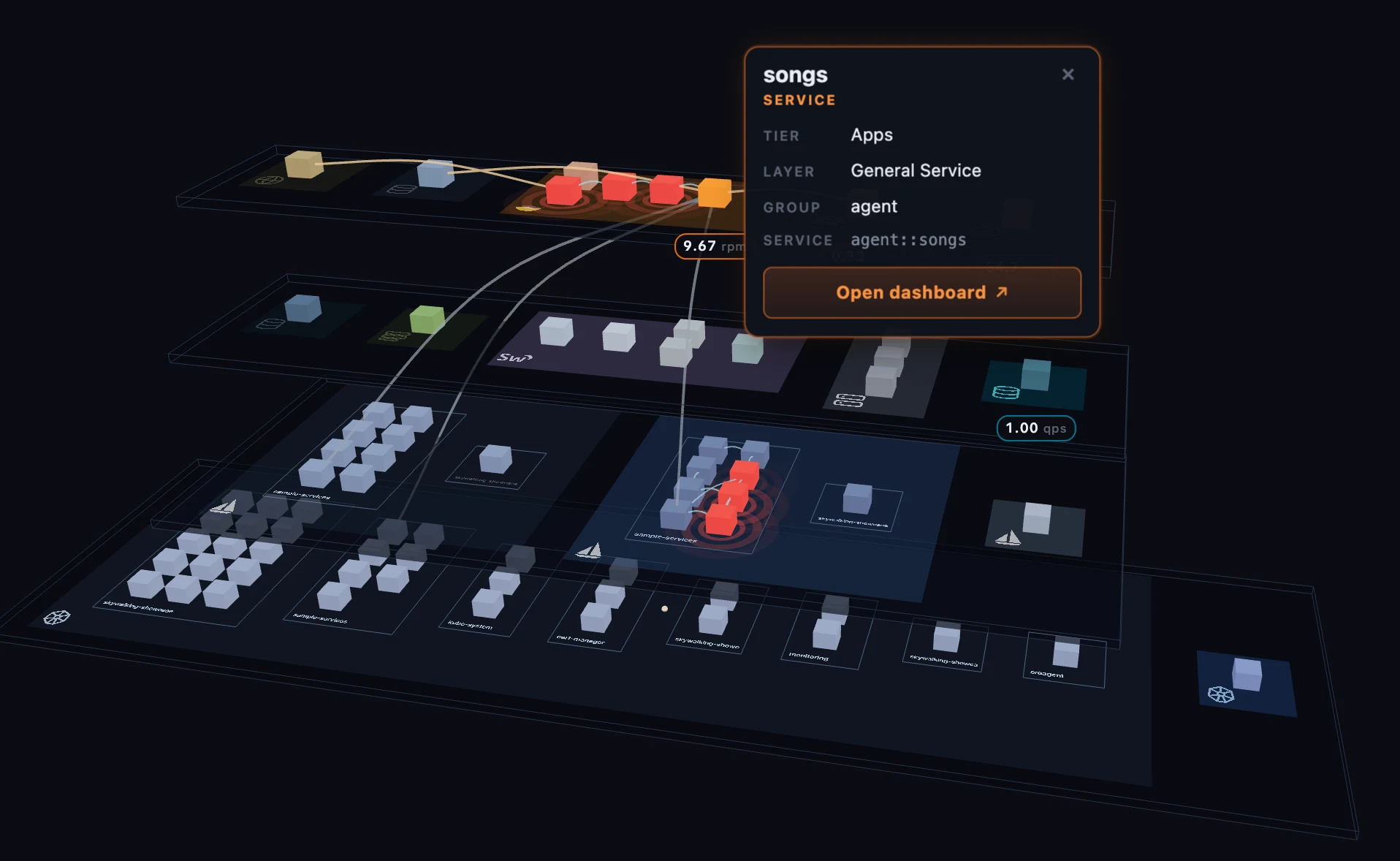 Figure 3: Select a cube and its identity links climb the tiers — one service, seen by its agent, the mesh, and Kubernetes.
Moving around
Drag to rotate, scroll to zoom, and arrow keys or WASD pan the view (hold Shift for a bigger step); a top-left toolbar offers the same gestures as buttons for trackpads. There’s one deliberate rule worth knowing: clicks inside the 3D scene never move the camera — they only select. Click a cube and it highlights, a detail card appears beside it (the service’s name, its tier and layer, and an Open dashboard button that jumps into that service’s layer dashboard in a new tab), and its hierarchy links light up. The camera-move surface is the side panel and the toolbar — click a layer row to glide the camera to its zone. Keeping those two jobs separate is what makes selecting a small cube feel reliable instead of having the cube slide out from under your cursor.
How it builds
A whole deployment is too much to fetch in one request, so the map loads in stages, and a slim timeline strip along the bottom shows the progress live: Services (the roster and their layers) → Templates (which layers carry a topology) → Topologies (each topology-bearing layer’s call graph) → Hierarchy (the cross-tier identity links) → Layout (placing the cubes) → Metrics (the per-service traffic, fetched in batches so the cubes light up progressively). Click any step for a drawer with its detail, or hit refresh to re-run the whole sequence.
Two touches make refreshes cheap. The hierarchy step is incremental — only services that are new since the last run get probed, the rest reused from cache, so a steady deployment costs nothing there. And the scene is re-keyed on a per-layer structure hash, so an unchanged refresh keeps your camera exactly where it was; only a real roster or edge change rebuilds the layout. Under the hood it’s Three.js with a thin Vue wrapper, every geometry and material shared across cubes of the same kind — the kind of detail that keeps a few hundred services rendering smoothly in a browser tab.
Configured, not coded
None of the above is a hard-coded “3D screen.” What the map shows is driven by a single configuration an administrator edits in a structured form editor at /admin/3d-map — tiers, layers, colors, and metrics through form controls, not raw JSON. From it you can:
- Filter layers with one global regex — anything it excludes drops off the map entirely.
- Arrange tiers — rename them, reorder them top-to-bottom, and pin each layer to a tier (with a nominated failover tier so nothing falls off silently).
- Group layers — cluster several related layers (the SkyWalking self-observability components, say) into one labelled block, each member keeping its own color.
- Color each layer and choose its traffic metric — the MQE expression, a label, and a unit, seeded by default from that layer’s dashboard template so most layers show a sensible number out of the box.
Horizon ships a bundled default, so the map is useful immediately; your edits live as a local draft until you Check diff & push them to OAP — the same draft → preview → publish model behind every dashboard, and the same Export/Import for backup or moving a configuration between deployments. The map itself is a read-only observe surface that runs against your current OAP; publishing the config that shapes it is part of the config-driven customization story a later post in this series covers end to end.
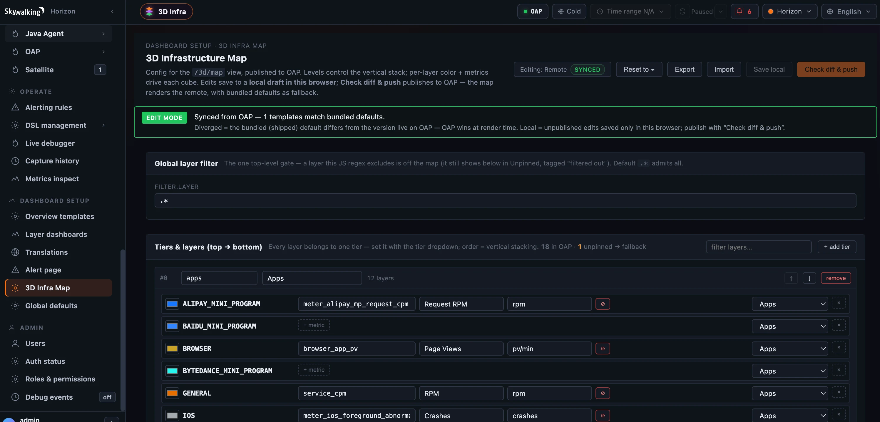 Figure 4: The map is configuration, not code — tiers, colors, and per-layer traffic metrics edited as a form, then published to OAP.
Where to go next
The 3D map is the bird’s-eye summary; the 2D per-layer pages stay the authoritative service maps. Viewing it needs only read access (infra-3d:read, held by the built-in viewer role and up); shaping it needs the same write permission as the dashboards. For the field reference — tiers, the config shape, the loading stages — see the 3D Infrastructure Map docs.
Next up: the Trace Explorer — from the bird’s-eye view of the whole deployment back down to a single request, drawn three different ways.